What Is Architecture?
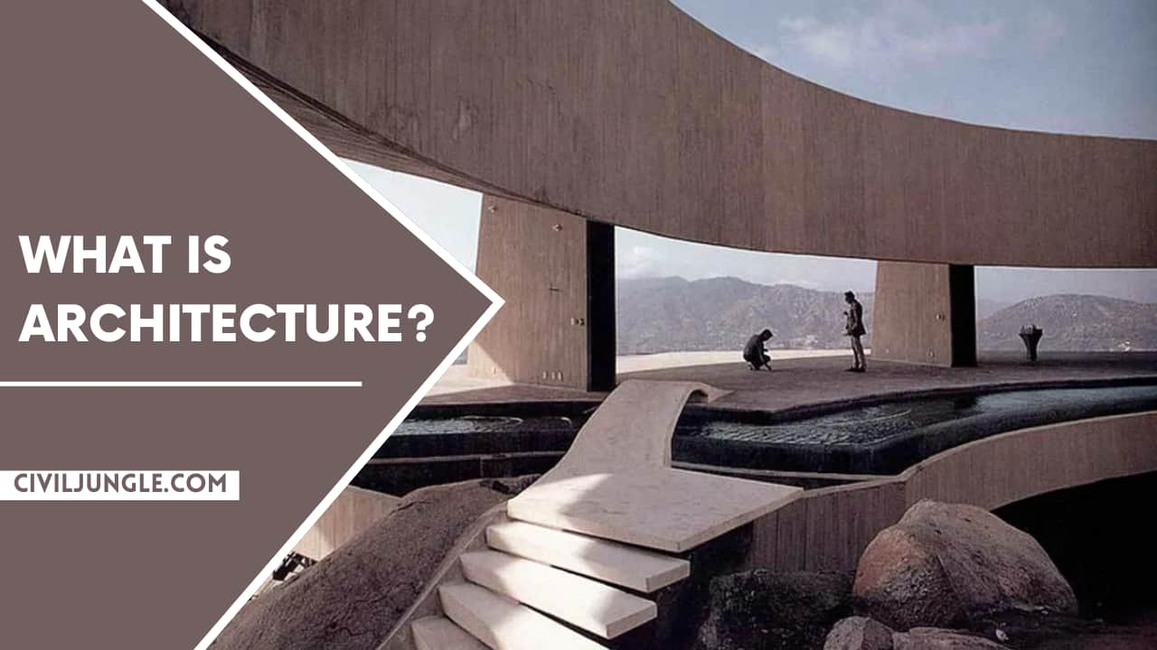
The techniques and art of making the layout of buildings and constructing the building are architecture.
Designing and decorating, selection of furnishings, having supervision for construction, and renovating or remodeling a building. Architecture is an art. Besides designing and constructing architecture deals with aesthetics.
Every building that was built by humans from the very first building to today’s large skyscrapers, is part of the architecture. Architecture is just not only art. It is a combination of science and art.
Why Need Design Principles in Architecture?
The design principles or elements are extremely important for understanding optical configurations. Not only the exterior but also the interior design in architecture considers having a great role.
Including initiation of creativity and gratitude of art in numerous forms, design principles serve some very important purposes. To make something more useful and more functional.
There is a process on the artboard that is entangled to create a good design. However, creating a good design is far more than that. The principle of design in architecture ensures that the construction is useful and the final product is well made and ready to be used.
Principles of Architecture
Good design is the result of experience. A lot of experience is needed to build something that has a perfect design, looks great, and the usefulness of something boosts.
Whatever is made must have a use. Sometimes using a device or any other thing which is largely needed to do many tasks in our daily lives is difficult because of its absurd design. And also devices or projects with a bad design makes it look bad.
For getting some good results it is necessary to gain experience. For creating something great there need to be many trials, errors, and knowledge.
One must learn from his mistakes to gain expertise. Anyway, there is something more that needs to be paid attention to make good designs. These things or rules are known to us as principles of architecture.
Talking about the number of principles of architecture, it is said that more or less a dozen central principles of architecture are there. But there exist some other principles along with the central principles of architecture.
These are known to us as secondary principles of architecture. Some experts consider some of these other secondary principles as inferior to basic and central principles of architecture but some experts give good attention to these secondary principles in the field of architecture.
So it is really hard to tell how many fundamental principles or basic principles are there regarding architecture. Anyhow, even if the secondary principles could be ignored, an expert architect should always pay considerable attention to the basic principles of architecture that are given below.
1. Contrast
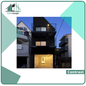
Most of us are knowledgeable of this term, especially those who deal with colors and photography. For those who do not know what contrast is, explaining it is quite simple.
In a design, if there is more than one element, sometimes the elements pop more, and sometimes the colors and elements do not stand out from each other.
The adjacent elements or complexions, and hues have a difference and that stands out. In easy words, contrast is the principle that makes a design with different elements put together and each of the elements has its presence.
Contrast means variation. Variation is considered an element of design. So contrast is also considered an elementary principle of design. The contrast gives extra attention to a particular part of the design. It emphasizes a specific part of the rest of the design.
Contrast can prevail in numerous varieties. The contrast of texture is a method that draws attention to a particular point or place of a design by the texture. The contrast of color and shape also makes someone look at a particular point of a design.
Some other types of contrast are also possible. These are like the contrast of scale, the contrast of size, etc.
2. Balance
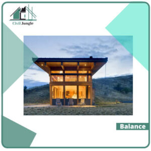
There is a term called visual weight. Visual weight is the property that gives elements in a design an ability to draw attention. If an element has a light visual weight that means that the element is unlikely to catch the attention or draw the eye of someone.
Whereas if an element has a high visual weight that means that this element has the probability of drawing eyes towards it. In a design, all the elements with light and high visual weight are put together in a way that the looker gets a sense of balance. It is called the principle of balance.
For visual stability, it is a matter that must need to be prioritized in making a design. For this visual stability opposite forces are put together in such a composition that gives it the stability or balance.
Balance is an interesting property. If you have a rod and you want to keep in its equilibrium that it does not fall on any side then you need to balance it right in the middle.
If a small weight is put on one side of the rod and another side a bigger weight is put then it will not balance in the middle. In other words, a small object at the edge will be balanced by a large object near the middle. This is the principle of balance. Visual balance works just the same as physical balance.
There are two types of balance, symmetrical balance, and asymmetrical balance. Symmetrical balance means balance in the middle by putting equal weight on both sides of a design.
Symmetrical balance is also split into two parts one is known as radial symmetry and the other is known as bilateral symmetry.
Asymmetrical balance is a much more complicated principle. In asymmetrical balance elements with different visual weights are balanced in a way that includes shifting the fulcrum point. It is studied in physics.
3. Emphasis
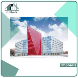
The term emphasis indicates highlighting a particular part of something. It is giving priority to an important part over the other parts. This is applied as a principle of design. It is a way in which attention is brought to what is exactly the most important in the design.
Visual hierarchy is a method in which the elements are arranged or organized by their significance or priority.
That means the most important component will be placed in such a way that it gets the most attention and just like that the least important element will be put in a way that it gets the least amount of attention.
There are many processes of emphasizing. Some of these are making it bold and bright, adding special visual effects, changing colors, etc.
4. Proportion
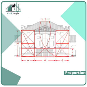
Understanding this principle is very easy. This principle of design, and proportion, motion the importance of an element. It indicates which materials or elements are most important in a design and which elements are not important.
Proportion is the comparison of height, length, breadth, or simply put size. Elements with bigger sizes are more valuable than elements with tinier sizes.
5. Hierarchy

Hierarchy is a crucial component of design. Hierarchy relates to the means of processing subjects by utilizing a website portal. Hierarchy indicates the significance of components within a design. It means arranging the most important element as the most important element.
For example, while preparing a list of the most prioritized things the list is made by using the hierarchy method. The list is sorted in such a way that the most important things appear at the beginning and the least important things appear at the end.
In architecture, hierarchy means giving more priority to the space or room that has more functionality or vitality than other rooms. The rooms or spaces can be more than one. For articulating the fact that one space or room is more important than other rooms there it must be on a distinct scale.
6. Repetition
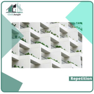
To reinforce an idea in a design it is a great principle to follow the repetition. If a lot of different elements are to be brought together and make a unified design this method needs to be followed. You can arrange a lot of different elements together through this method.
There are many ways to apply the repetition principle in a design. Some of these ways are such as repeating shapes, and colors. Repeating typefaces is also a well-preferred way to apply the repetition principle in a design.
But while doing repetition one should pay attention to not overdoing the process. It will ruin the design.
7. Rhythm
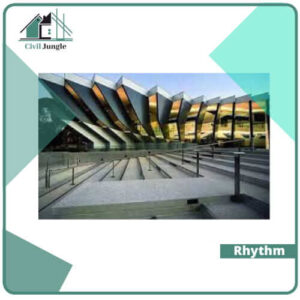
For offering a sense of reiterating visuals to the viewer sometimes intentionally there are variations made in the design. These intentionally made variations between elements are called rhythm.
The carved space between elements that are repeated causes a rhythm to construct. In music, the gap or space between two different notes creates a rhythm. In architecture, this applies also.
There are many types of rhythm in architecture. These follow as regular, alternating, random, progressive, and flowing. Random rhythm is a type of rhythm that has no specific pattern. In regular rhythm, components follow the same pattern.
Rhythms build numerous feelings and attract the visitor’s eyes. If large buildings are built in a rhythm between floors it looks attractive. Also, this rhythm can be followed inside the buildings.
8. Pattern
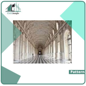
Multiple structure elements functioning together if repeated numerous times will create a pattern. It is nothing but the repetition of the same design.
In architecture, for making something big this method is applied. It makes the structure look good and attractive. Creating a pattern is a good idea for large constructions from the perspective of aesthetics.
9. Movement
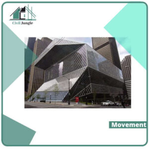
Our brain has the nature to perceive some specific things first and other things after that. That’s the reason our eye catches some visuals first and some visuals do not appear the first in our eye. The human eye can see one thing at a time.
For seeing a thing the eye needs to focus on it. Though we humans have two eyes we can focus on only one thing at a time. That means for seeing a large sight our eyes need to travel from one point to another. This is the reason there is a pattern of looking at certain things at first and then other things.
The most significant and crucial element should be looked at first. This is done by a rule known as positioning. The elements are positioned in such a way that no matter where we look at first, the design will lead your eyes to the main attention of it.
This is called movement. In architecture, it is seen largely in luxurious places, especially places where a lot of people visit.
10. Variety
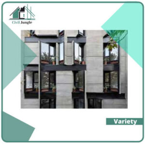
To create visual curiosity the principle of variety is used. The same design all over the construction sometimes creates a boring and monotonous scene. This can make the looker uninterested in anything. In architecture, the principle of variety is needed to avoid this issue.
Variety in architecture can be created in many ways. Some of these ways are variations in color, variations in shapes, typography, and images.
Principles of Architecture PDF: Click Here
Frequently Asked Questions (FAQ)
What Is Architecture?
Architecture is both the art and science of designing and constructing buildings and other structures. It involves creating layouts, selecting materials, supervising construction, and often includes renovating or remodeling existing buildings. Architecture combines artistic design with functional and structural considerations.
Why Are Design Principles Important in Architecture?
Design principles are crucial for creating visually appealing and functional structures. They help ensure that a design is not only aesthetically pleasing but also practical and useful. Principles such as contrast, balance, and proportion guide architects in making decisions that enhance both the form and function of a building.
What Are the Central Principles of Architecture?
Central principles of architecture include:
- Contrast: Differentiating elements to highlight and emphasize specific parts of a design.
- Balance: Achieving visual stability through symmetrical or asymmetrical arrangements.
- Emphasis: Focusing attention on the most important elements of a design.
- Proportion: Understanding the importance of size and scale within a design.
- Hierarchy: Arranging elements to indicate their relative importance.
What Is the Difference Between Symmetrical and Asymmetrical Balance?
Symmetrical balance involves distributing visual weight evenly on both sides of a design, creating a mirror image effect. Asymmetrical balance, on the other hand, involves arranging elements of different visual weights in a way that achieves balance without symmetry, often requiring more nuanced adjustments.
How Does Contrast Impact Architectural Design?
Contrast in architecture highlights differences between elements, such as colors, textures, and shapes, to make specific parts of a design stand out. This helps in drawing attention to key features and creating visual interest.
What Is the Principle of Repetition, and How Is It Applied in Architecture?
Repetition involves using similar elements, such as shapes, colors, or textures, to create a cohesive and unified design. In architecture, repetition can enhance aesthetic appeal and reinforce thematic elements across a building.
How Does Rhythm Influence Architectural Design?
Rhythm creates a sense of movement and continuity through the repetition of elements with variations. It helps guide the viewer’s eye through a space, creating a dynamic and engaging visual experience.
What Role Does Hierarchy Play in Architectural Design?
Hierarchy helps prioritize the importance of different elements or spaces within a design. By arranging elements according to their significance, architects can direct attention to key features and ensure functional spaces are highlighted appropriately.
Why Is Proportion Important in Architecture?
Proportion refers to the relationship between different elements in terms of size and scale. It helps in creating harmony and balance within a design, ensuring that elements are appropriately sized relative to one another.
What Is the Principle of Movement in Architectural Design?
Movement refers to the way the human eye travels across a design. Architects use positioning and visual cues to guide viewers’ attention to focal points and important features, ensuring that the design is experienced as intended.
How Does Variety Enhance Architectural Design?
Variety introduces different elements or variations within a design to maintain visual interest and prevent monotony. It can be achieved through changes in color, texture, shape, and other design aspects, making the overall design more engaging.

